Jan 28, 2025
Building a Multi Tenant Design System for Scale and Consistency
A flexible design system built to support multiple tenants, each with its own brand identity. The system uses a token driven foundation with consistent components and layouts that adapt visually while keeping structure intact. This reduces duplication, accelerates delivery and gives engineering a clean, scalable framework to work with.
Design System
Product Design
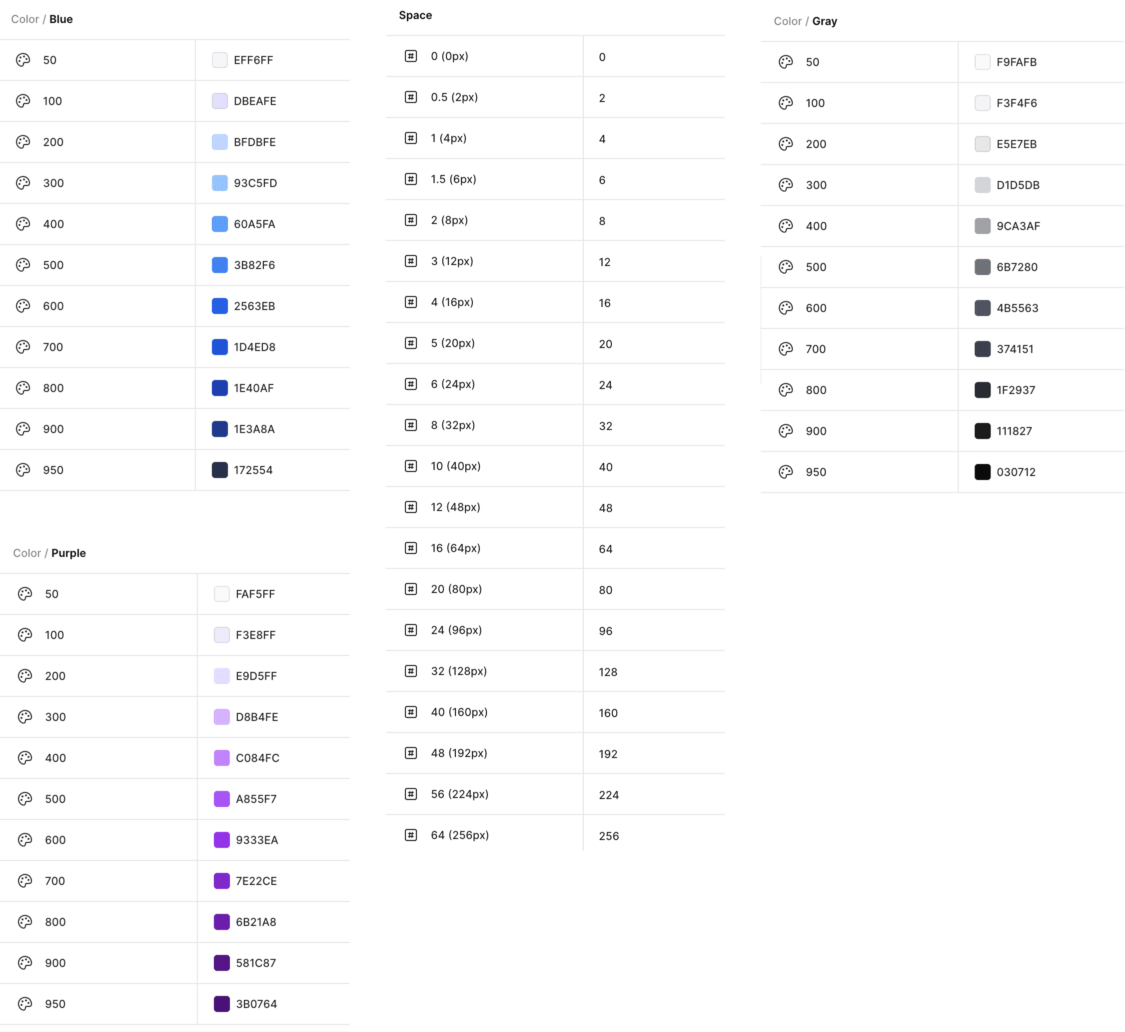
Primitive Tokens
Powering White Label Products with a Flexible Design System
Primitive Tokens
Primitive tokens are derived from Tailwind CSS scales, giving the system a mathematically consistent foundation. These include the base spacing scale and color scale. Primitive tokens are never used directly in components. They exist as a stable baseline that ensures predictability for engineering teams already using Tailwind.
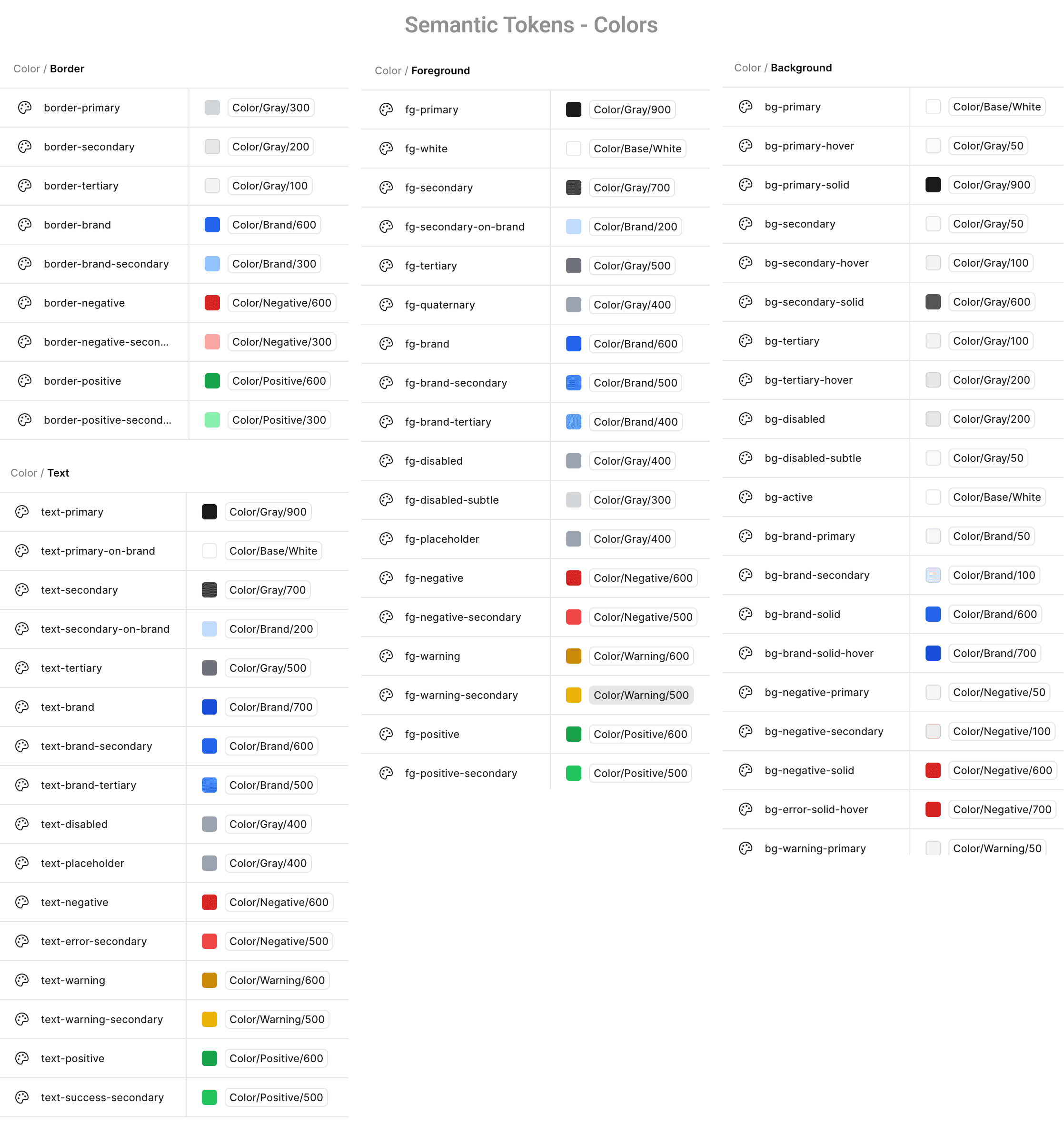
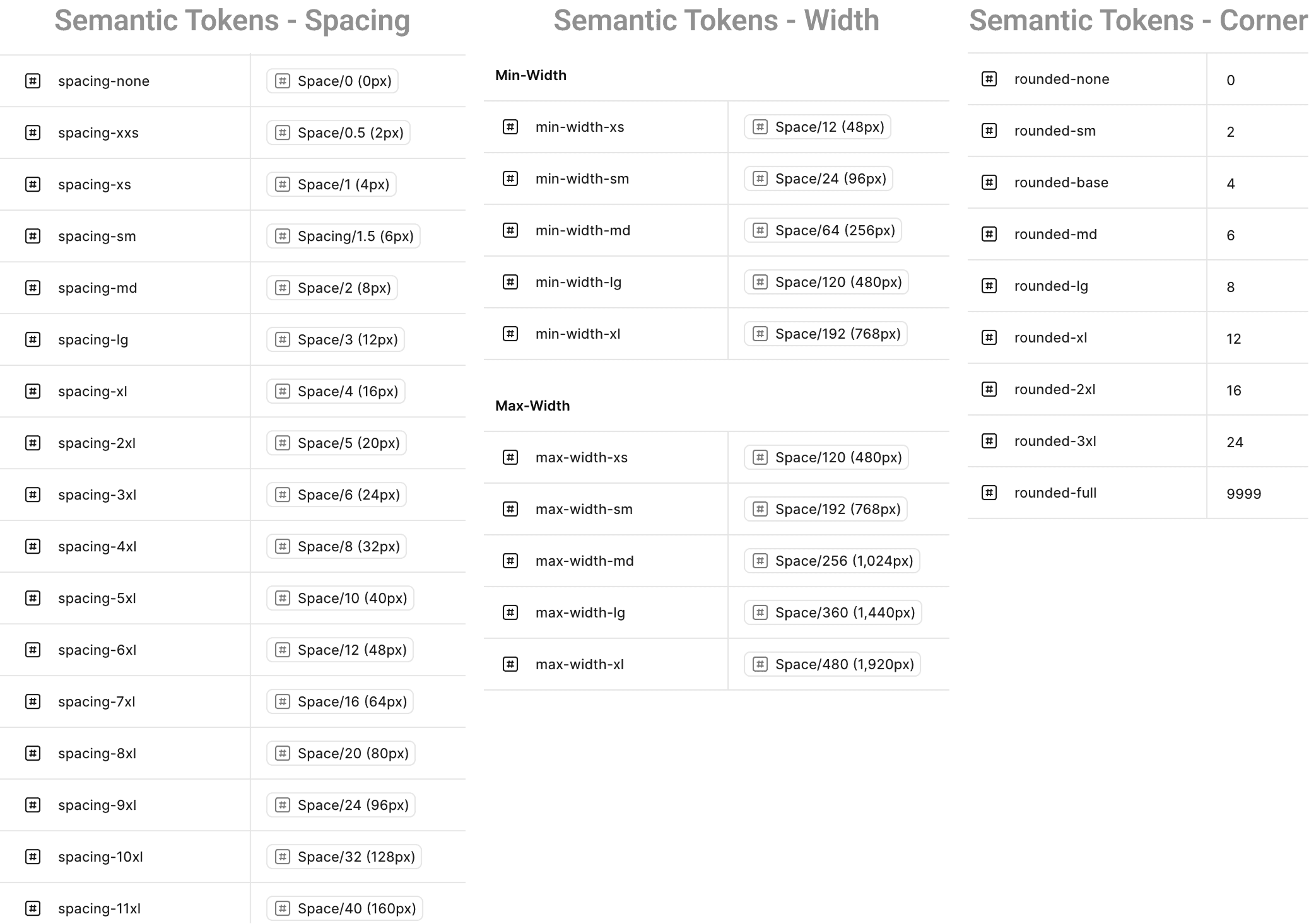
Semantic Tokens
Semantic tokens map directly to primitives but are named by intent. These are the only tokens used throughout the UI.
Semantic tokens cover color, typography, spacing, width, radius and iconography. They allow tenants to rebrand by updating only token values instead of component logic. This enables rapid theme switching without engineering involvement.
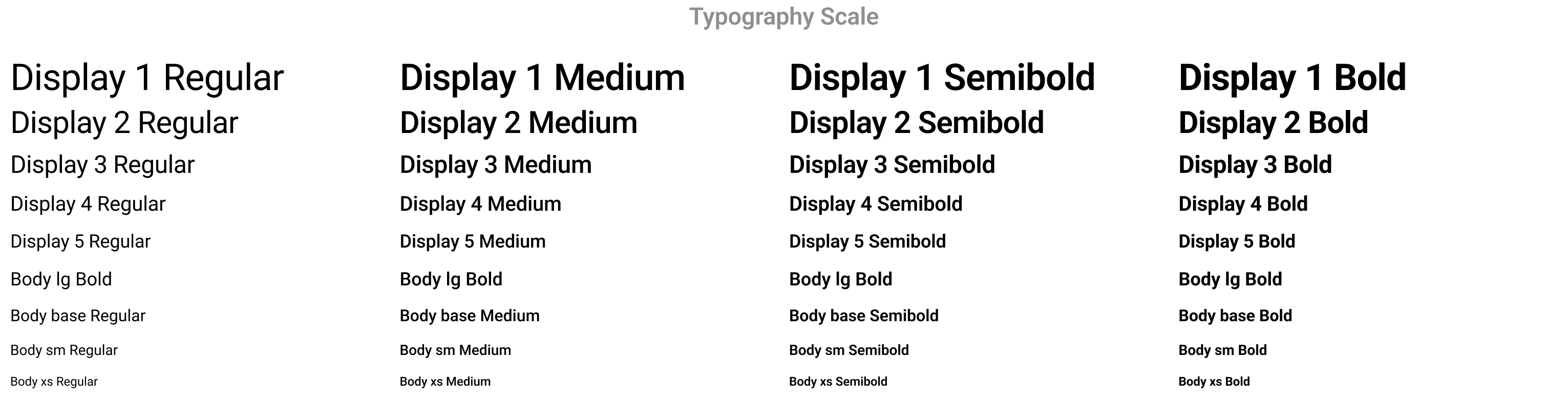
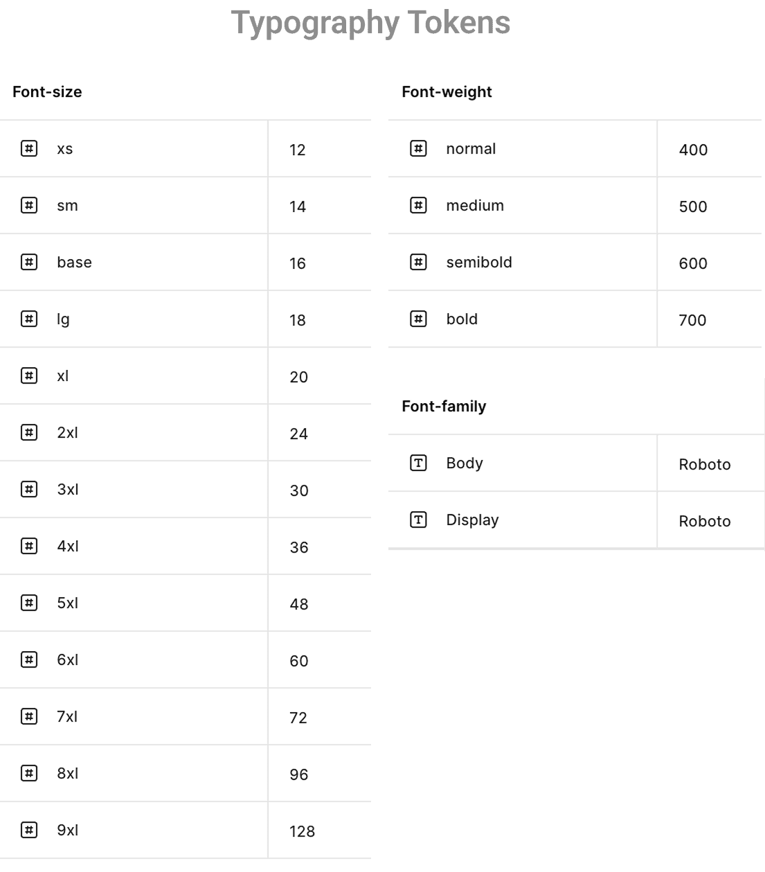
Typography
Typography is fully tokenized to allow rapid rebranding across tenants while maintaining structural consistency.
Typography uses tokenized values for size, weight and family. Each text style is constructed from these tokens. Line height is expressed using percentages to maintain consistent vertical rhythm. This structure ensures every tenant can switch typefaces or adjust text styles without changing any component code.
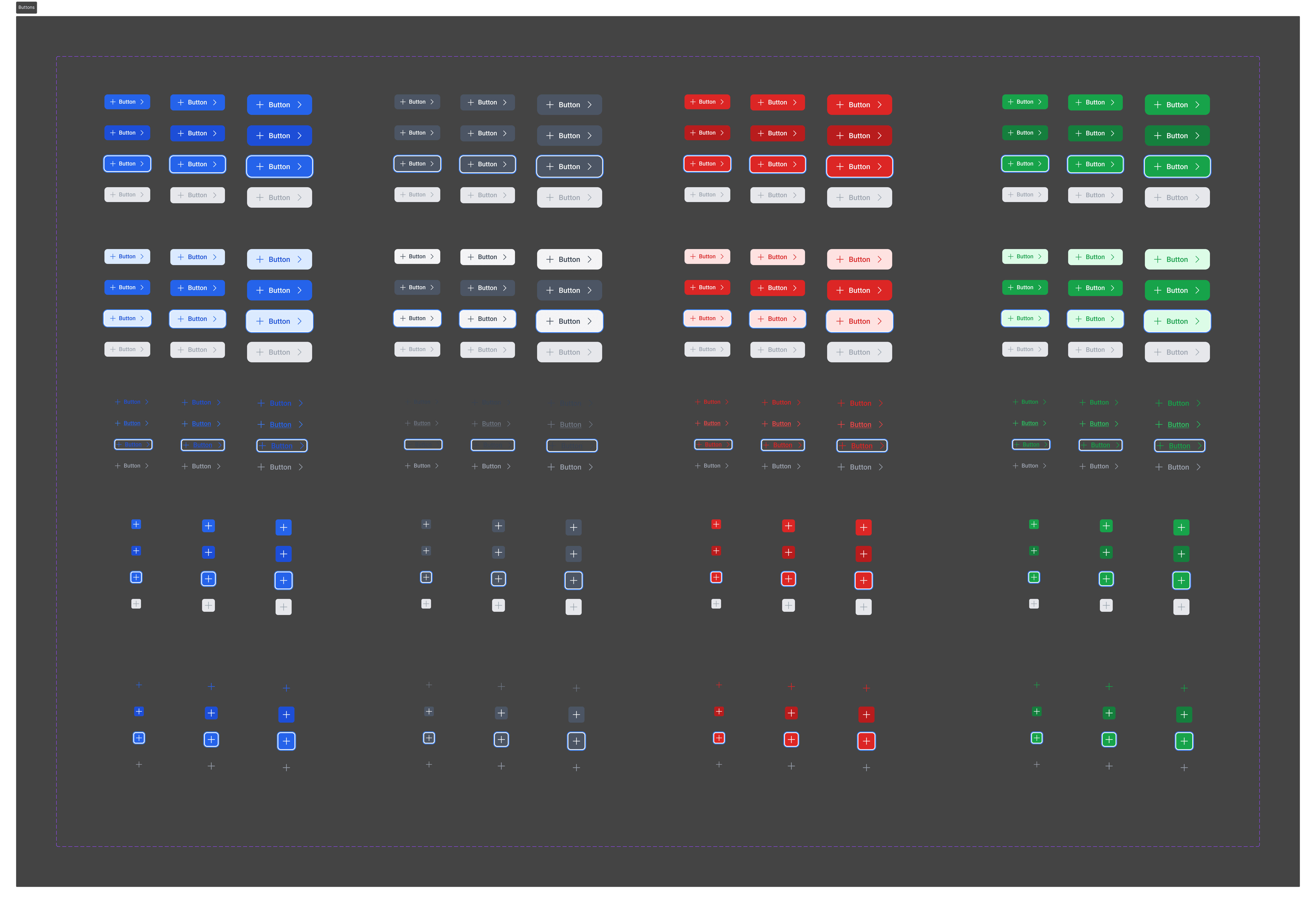
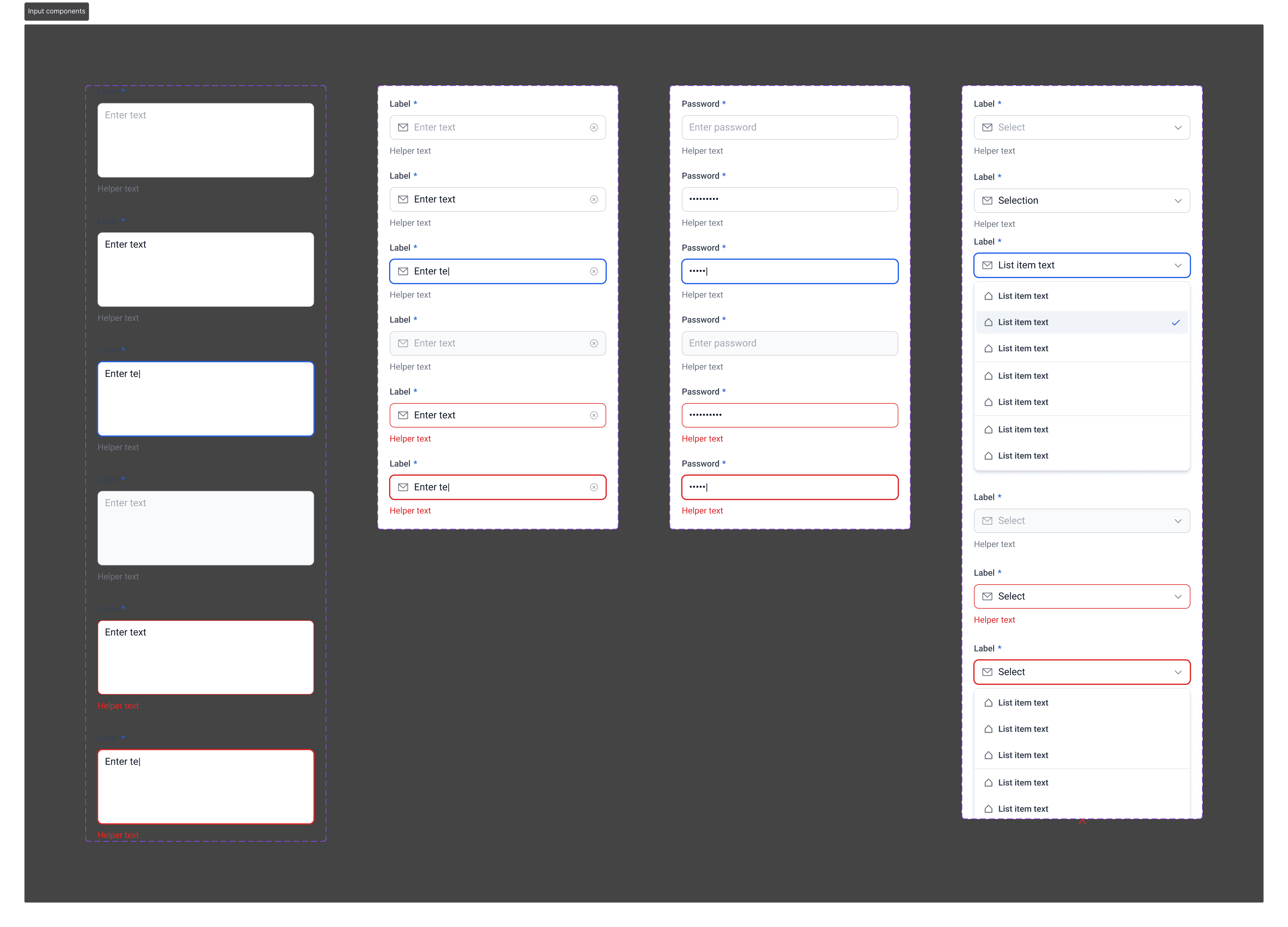
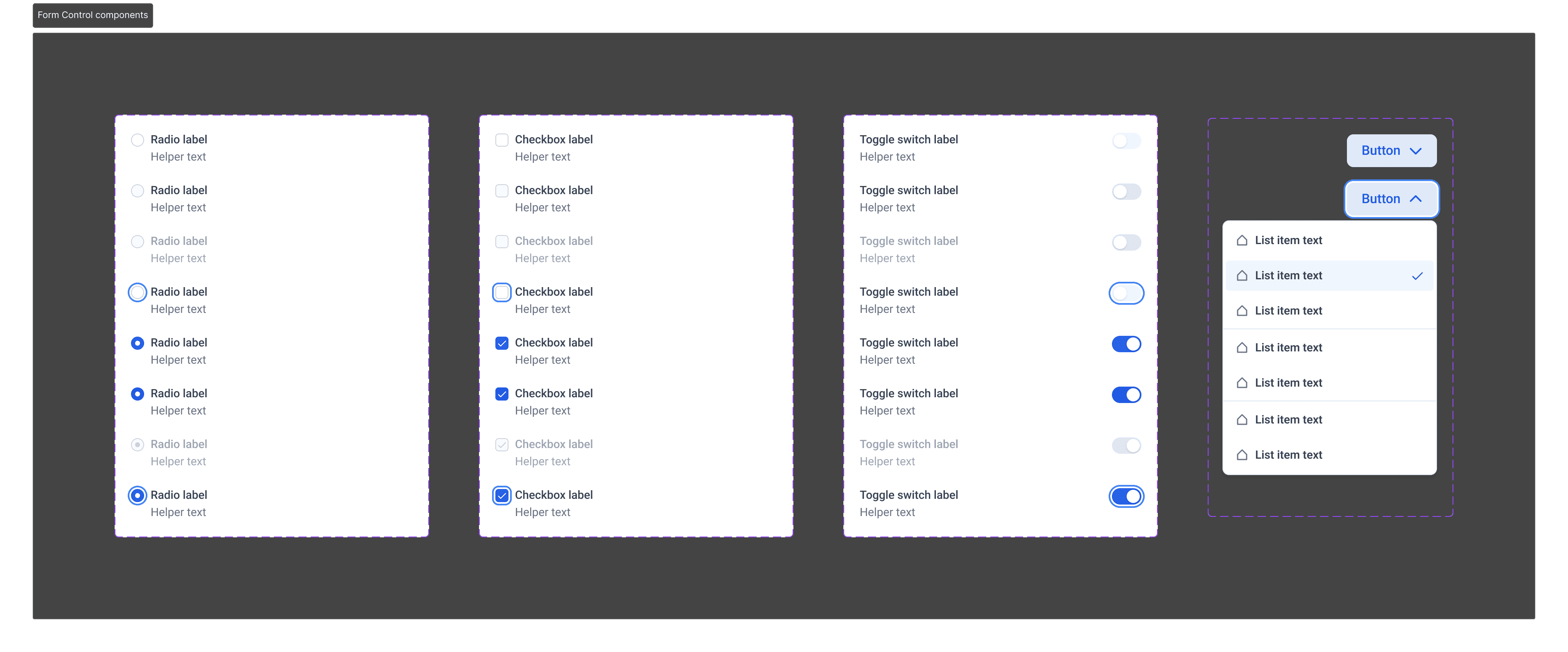
Atomic Components
The smallest reusable building blocks. Each atomic component inherits semantic tokens, so branding changes apply automatically.
Atomic components include form controls such as radio buttons, checkboxes, toggles and dropdowns. Inputs for text, password, dropdowns and textarea. Buttons across brand, neutral, success and destructive styles. Badges for status communication and dividers for structure. These components establish predictable and accessible UI behavior.
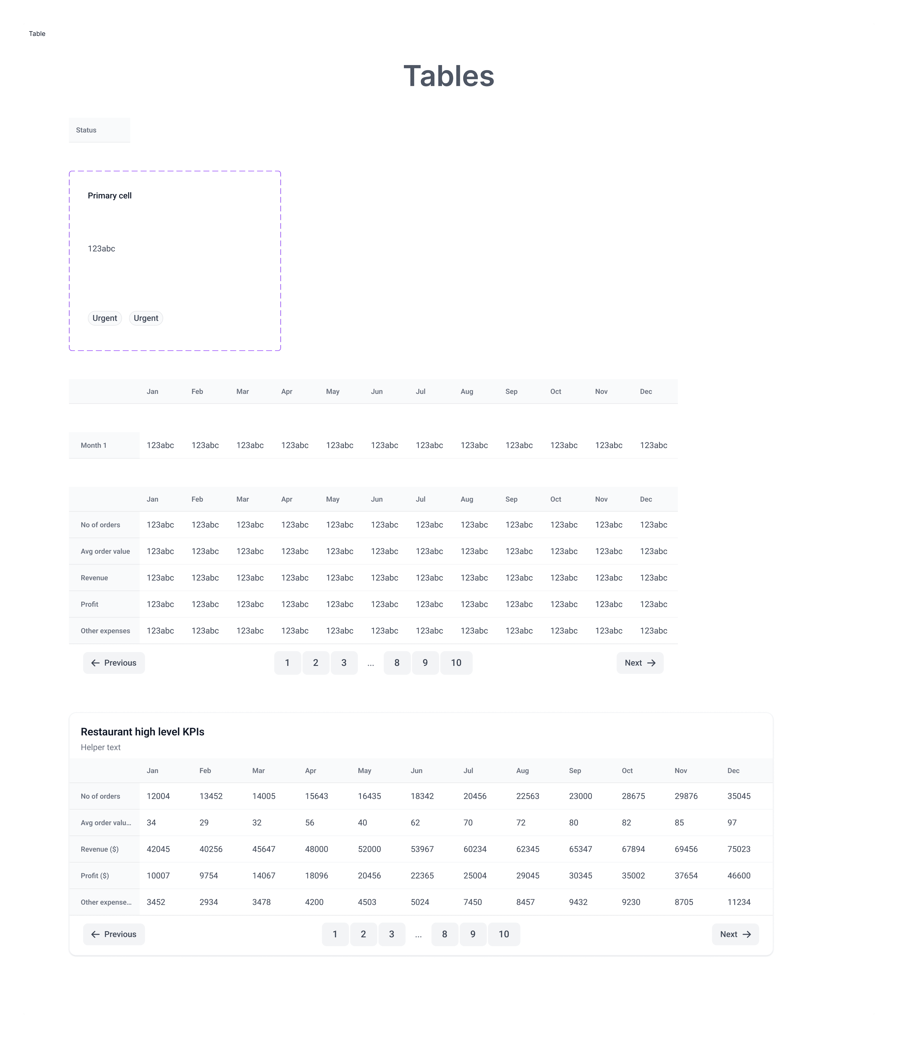
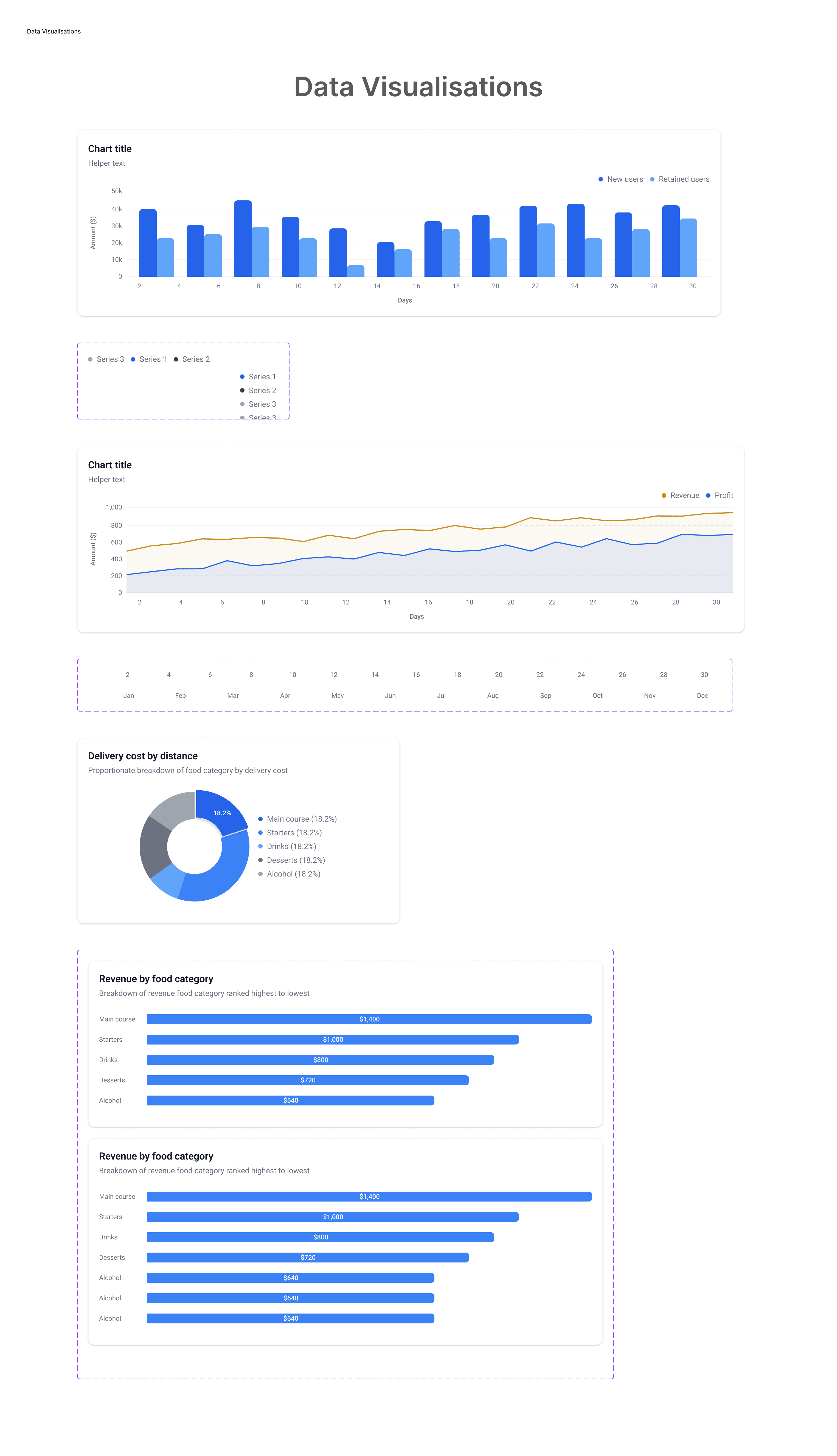
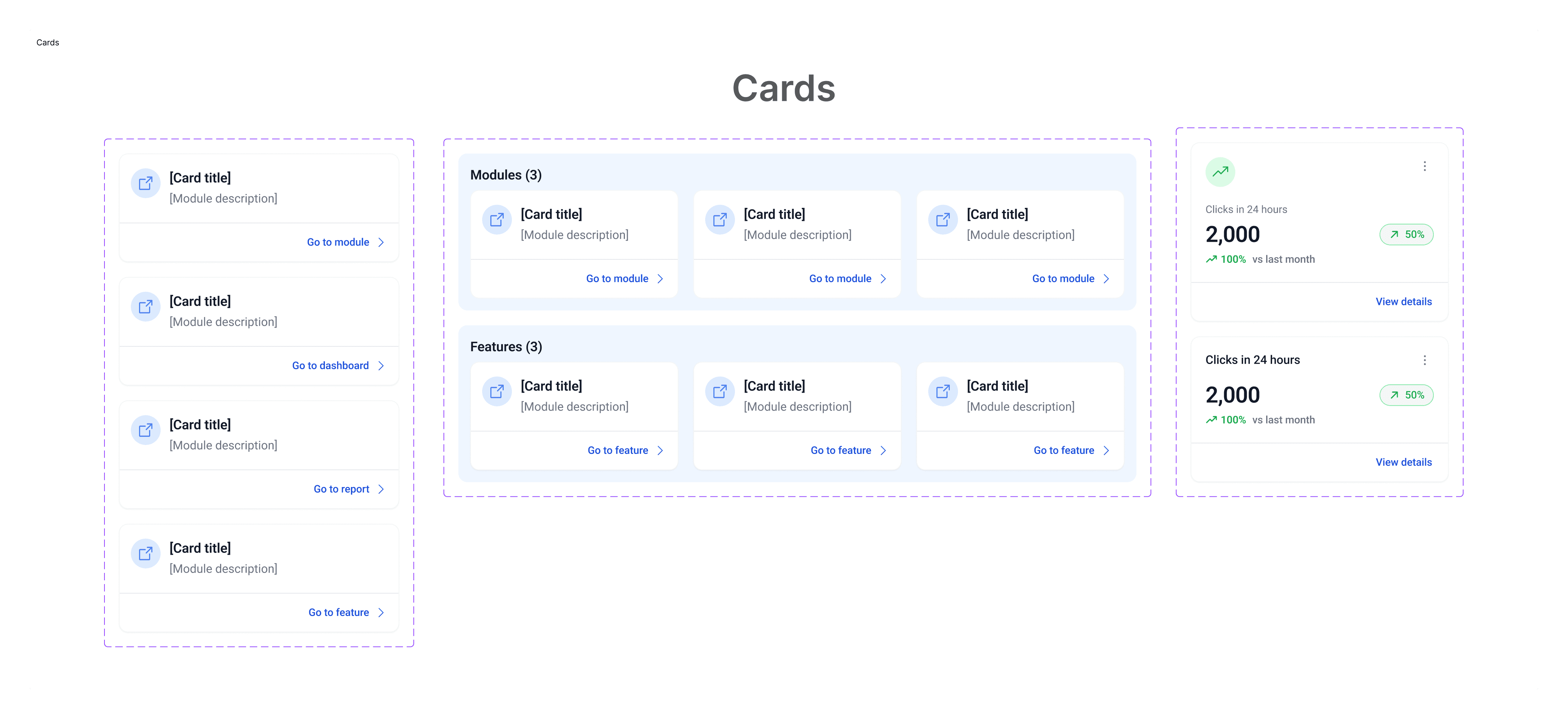
Composite Components
Larger components created using atomic ones. These represent common functional patterns across the product.
Composite components include tables configured for sorting and responsive behavior, charts aligned with semantic tokens, cards for grouping content, KPIs for high visibility data and trend indicators for quick directional insights. New composite components can be added without breaking consistency.
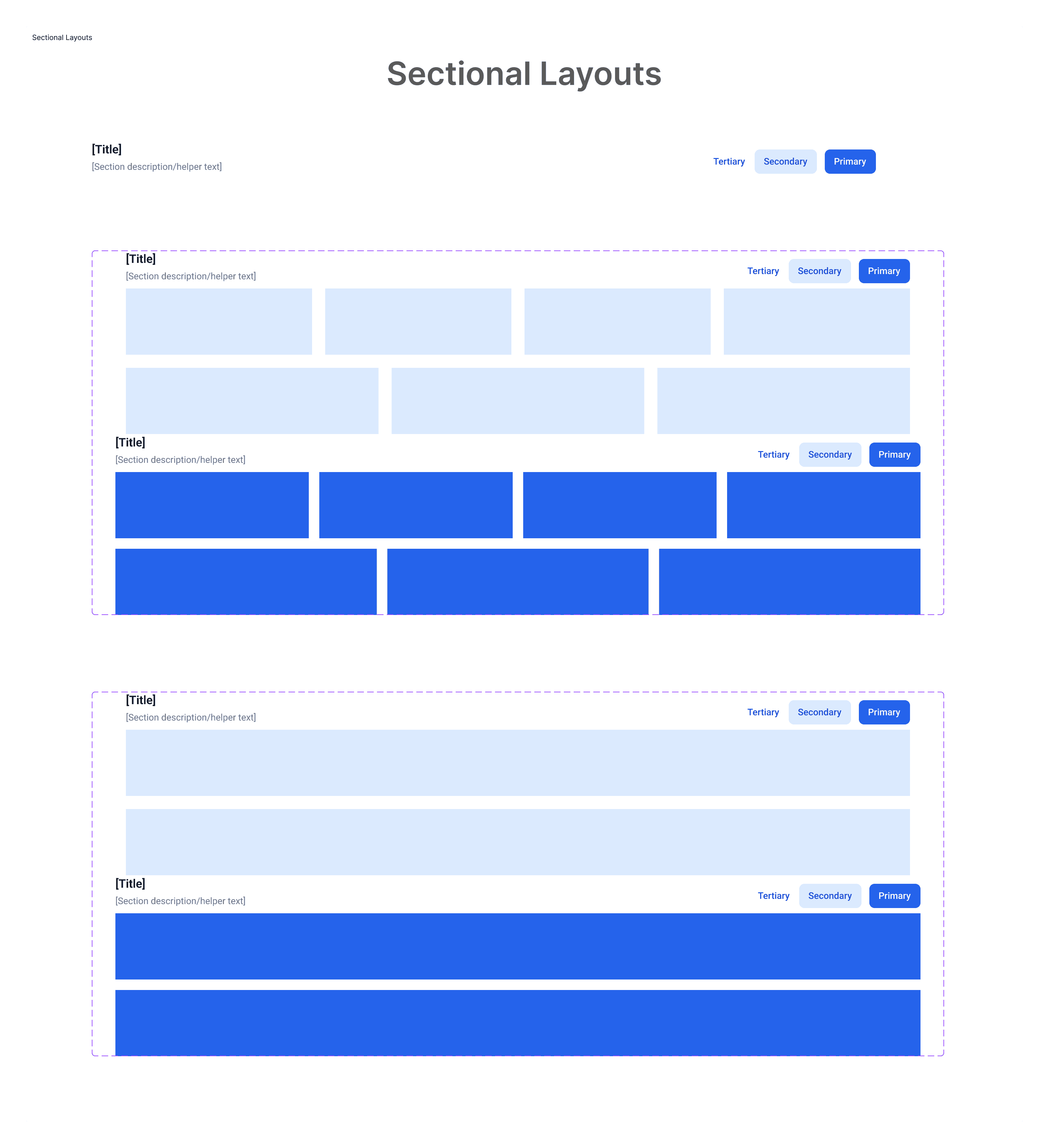
Layouts
Layouts determine how components form complete screens. They handle spacing, structure and breakpoints.
Layout has two layers. Sections act as shells and come in stacking or wrapping formats. Pages define how multiple sections combine into a cohesive screen. Breakpoints at 1024 and above, 768 to 1024 and 320 to 768 ensure smooth adaptation across devices.
Multi Tenant Flexibility
The token framework allows each tenant to fully customize their brand identity without modifying component structure.
Tenants can adjust typography, colors, spacing preferences and corner radii by updating semantic token values. Components remain untouched. This keeps engineering efficient and ensures each tenant gets a distinct brand identity.
Outcome
A design system built to scale across multiple tenants while staying consistent at a structural level.
Tokenization makes rebranding simple. Atomic components create strong foundations. Composite components accelerate development. Layouts ensure screen coherence across breakpoints. The system reduces duplication, speeds up design and engineering work and ensures polished, consistent interfaces across all tenants.
More Works


FAQ
01
What kind of projects have you worked on?
02
How do you usually collaborate on projects?
03
Do you take freelance or consulting projects?
04
What tools do you use?
05
How do you approach new projects?
06
Can you help set up a design system?
07
How can I get in touch?
Jan 28, 2025
Building a Multi Tenant Design System for Scale and Consistency
A flexible design system built to support multiple tenants, each with its own brand identity. The system uses a token driven foundation with consistent components and layouts that adapt visually while keeping structure intact. This reduces duplication, accelerates delivery and gives engineering a clean, scalable framework to work with.
Design System
Product Design
Primitive Tokens
Powering White Label Products with a Flexible Design System
Primitive Tokens
Primitive tokens are derived from Tailwind CSS scales, giving the system a mathematically consistent foundation. These include the base spacing scale and color scale. Primitive tokens are never used directly in components. They exist as a stable baseline that ensures predictability for engineering teams already using Tailwind.
Semantic Tokens
Semantic tokens map directly to primitives but are named by intent. These are the only tokens used throughout the UI.
Semantic tokens cover color, typography, spacing, width, radius and iconography. They allow tenants to rebrand by updating only token values instead of component logic. This enables rapid theme switching without engineering involvement.
Typography
Typography is fully tokenized to allow rapid rebranding across tenants while maintaining structural consistency.
Typography uses tokenized values for size, weight and family. Each text style is constructed from these tokens. Line height is expressed using percentages to maintain consistent vertical rhythm. This structure ensures every tenant can switch typefaces or adjust text styles without changing any component code.
Atomic Components
The smallest reusable building blocks. Each atomic component inherits semantic tokens, so branding changes apply automatically.
Atomic components include form controls such as radio buttons, checkboxes, toggles and dropdowns. Inputs for text, password, dropdowns and textarea. Buttons across brand, neutral, success and destructive styles. Badges for status communication and dividers for structure. These components establish predictable and accessible UI behavior.
Composite Components
Larger components created using atomic ones. These represent common functional patterns across the product.
Composite components include tables configured for sorting and responsive behavior, charts aligned with semantic tokens, cards for grouping content, KPIs for high visibility data and trend indicators for quick directional insights. New composite components can be added without breaking consistency.
Layouts
Layouts determine how components form complete screens. They handle spacing, structure and breakpoints.
Layout has two layers. Sections act as shells and come in stacking or wrapping formats. Pages define how multiple sections combine into a cohesive screen. Breakpoints at 1024 and above, 768 to 1024 and 320 to 768 ensure smooth adaptation across devices.
Multi Tenant Flexibility
The token framework allows each tenant to fully customize their brand identity without modifying component structure.
Tenants can adjust typography, colors, spacing preferences and corner radii by updating semantic token values. Components remain untouched. This keeps engineering efficient and ensures each tenant gets a distinct brand identity.
Outcome
A design system built to scale across multiple tenants while staying consistent at a structural level.
Tokenization makes rebranding simple. Atomic components create strong foundations. Composite components accelerate development. Layouts ensure screen coherence across breakpoints. The system reduces duplication, speeds up design and engineering work and ensures polished, consistent interfaces across all tenants.
More Works
FAQ
What kind of projects have you worked on?
How do you usually collaborate on projects?
Do you take freelance or consulting projects?
What tools do you use?
How do you approach new projects?
Can you help set up a design system?
How can I get in touch?